
Inanimate Life
I have always been inspired by historical architecture and it is a real privilege to take this interest in a new direction through photography and graphic design. My practice looks at the contrast of what we see and what we feel, separating the real from the unreal. I want to investigate what makes a space into a place and I have used this concept to shape my project.
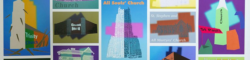
The subjects of my project are local architectural landmarks that illustrate the history of Bolton, an old industrial town, which grew into a thriving community after its economic boom. I have represented this in my work using two typology sheets, with the images creating a grid to further highlight a sense of unity and a ‘family of objects’. This has been influenced by Bernd and Hila Becher, staying true to their method of photographing similar objects and ordering them in a standardised grid. The photographs are black and white to deprive the viewer from the original colours, forcing the observer to focus on the heritage and stature each structure exudes.
I used the illustrative technique of abstraction, because emotions are an abstract concept, intangible, yet something we all experience daily. I used grids such as the rule of thirds and the golden section to guide my compositions. I then reintroduced colour, presenting the abstract compositions using colour as a storytelling tool. I have then combined the basic shapes and forms, allowing viewer to recognise each building within the compositions.
I developed this method further by looking at artists such as Lucas Dupuy, Sam Owen Hull and Peter Chadwick. I’ve also used typography to support the themes and individual character of each structure. The colour swatches are influenced by the individual history of each building and by my own interpretation, to make sure the illustrations go beyond what is visible on the surface and to truly explore what makes each space a place.


